
Respecting Common Sense, Realizing Inspiration | In-Depth Review of Layered Color-Temperature Commercial Lighting at Songjiang Impression City
On August 13, the "Fudan Light" series of salons was livestreamed via Ming Classroom and the Lao Hong Talks Lighting video channel. The event featured Gu Wenyi, a lighting designer at Difei Hotel Design Consulting (Shanghai) Co., Ltd. and an alumnus of Fudan University, who provided an in-depth analysis of the entire process behind the lighting design for Shanghai Songjiang Impression City.

Teacher Gu Wenyi graduated from Fudan University with a major in Light Sources and Lighting. With over 20 years of experience in lighting design, she serves on the editorial committees revising national standards such as “Urban Night Scene Lighting Design Standard JGJ/T 163” and “LED Indoor Lighting Standard GB/T 31831.” She excels in designing lighting for diverse commercial and hospitality spaces, seamlessly blending high-level standard-setting expertise with hands-on implementation.
This session focused on an outstanding case from the 2026 Lighting Innovation Award—the interior lighting design of Shanghai Songjiang Impression City. Located in Songjiang University Town, the project caters to students and young families, closely aligning with the architectural concept of “the fusion of two-dimensional and three-dimensional realms.” The project has been honored with the LIT Lighting Design Excellence Award, the CREDAWARD Urban Architectural Lighting Design Second Prize, and the 2026 Lighting Innovation Award.
Core Philosophy: Respect Common Sense, Realize Inspiration
In her presentation, Teacher Gu Wenyi introduced a guiding design philosophy that runs throughout: "Respect Common Sense, Realize Inspiration."
She offered a profound analysis of the current challenges facing commercial real estate lighting design:
The primary concerns of developers include commercial returns, safety compliance, cost control, operational efficiency, user experience, and project timelines—issues that have already crystallized into standardized protocols within large commercial groups.
Meanwhile, designers aspire to articulate concepts, craft unique spatial experiences, and thoughtfully consider circulation patterns.
"On the left are established paradigms, industry conventions, and proven pathways; on the right lies what we wish to express. A designer’s task is to find a narrow gap between these two," emphasized Gu Wenyi. "Innovation isn’t about overturning rules—it’s about identifying that small element worth changing."
Designers must understand why developers have set these guidelines and gradually address their concerns, rather than simply urging them to “be bolder.”
Key Design Elements:
A Layered, Three-Dimensional Color Temperature System Ranging from 2700K to 6500K
The Logic Behind Color Temperature Zoning
The most innovative aspect of the Songjiang Impression City lighting design lies in its creative integration with the interior space, employing a zoning and transitional color temperature scheme spanning 2700K to 6500K:
B1 Food Zone (A Bustling Market): Warm 2700K light creates a lively, down-to-earth atmosphere.
Mid-Level Retail Area: Neutral 3000K–3500K light complements a fashionable shopping ambiance.
Top-Level Trendy Play Zone (Two-Dimensional Realm): Cool white 4000K–6500K light enhances the tech-savvy vibe and resonates with anime-inspired settings.
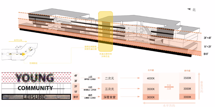
This color temperature zoning wasn’t arbitrary—it was meticulously aligned with the architect’s narrative logic. The building itself features distinct layering in materials, wall textures, and floor hues, and the lighting designer’s role was to “carry forward” this story, ensuring that light and space harmoniously merge.
The complete narrative unfolds as follows: Songjiang is Shanghai’s cultural birthplace, with the Guangfulin archaeological site embodying deep historical roots, while Songjiang University Town attracts a vibrant younger demographic.
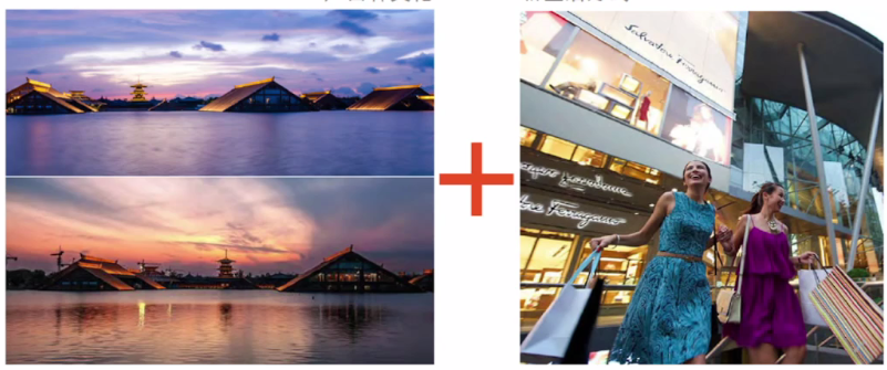
The aim is to blend Guangfulin’s rich historical and cultural elements with the modern lifestyles of young visitors and families.
A Dual Color Temperature Imagery in the North and South Atriums
The project boasts two atriums—one running north–south, approximately 70 meters in span. The northern atrium is designated as a “two-dimensional” space, featuring cooler color temperatures (up to 6500K), echoing the octopus‑like water‑molecule installation at its apex. Meanwhile, the southern atrium leans toward a “three-dimensional” aesthetic, bathed in warm, neutral light.
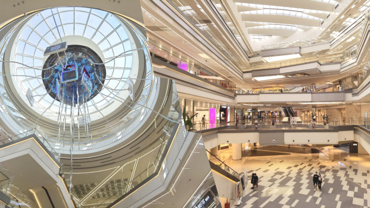
Gu Wenyi specifically noted that despite the stark contrast in color temperatures between the north and south atriums, no visual disconnection occurs on-site. This is thanks to carefully crafted gradient transitions and the infusion of natural light, resulting in a remarkably cohesive spatial experience.
"This project is one I’m particularly eager to recommend to clients, because within a single space, you can journey from 2700K underground all the way up to 6500K at the top, experiencing every color temperature firsthand."
Implementation Challenges: The Price of Inspiration
The entire layered color temperature system relies on extensive self‑illuminating LED strips, which represent both the project’s greatest innovation and its most significant challenge. Teacher Gu Wenyi thoroughly reviewed the practical issues encountered during installation:
1. Discontinuities in Brightness During Color Temperature Transitions
The project utilized 28W linear color‑changing LED strips for inter‑floor transitions. These strips employ dual sets of LEDs for mixed-color illumination, but when dimming transitions occur, power drops sharply to 14W, creating noticeable brightness disparities. Ultimately, the team adopted two solutions: first, custom‑made segmented fixed‑color‑temperature strips (each 5 meters long, subtly transitioning from 3300K to 3400K) to mitigate visual inconsistencies; second, using smoke‑proof drop ceilings and finished partitions to physically separate sections, avoiding the abrupt seams often seen in continuous strip installations.
2. Adjusting Unconventional Decorative Lighting Features
The project extensively employed triangular self‑illuminating panels, metal wind‑blown blades, and distinctive illuminated mesh screens—each presenting uniformity challenges: acrylic joints showing dark streaks, uneven illumination on one side of metal panels, and imbalanced brightness between upper and lower sections of ceiling light boxes. Through repeated on‑site prototyping and testing, the team fine‑tuned fixture mounting angles and added supplementary auxiliary light strips to achieve optimal results. Gu Wenyi advises peers to build ample time for multiple rounds of field testing when working with similar unconventional designs.
3. Obstructions Caused by Multi‑Level Overhead Lighting
Lighting fixtures installed along staircases and in double‑height areas were not cross‑checked against facade drawings, leading to upper‑level lights obstructing lower‑level spaces. In the end, additional recessed downlights had to be installed on site. She emphasizes that commercial lighting design should always involve simultaneous planar and elevation reviews of all projected lighting points.
4. Managing Compliance Boundaries for High Color Temperatures
The 2700K–4000K range fully complies with national indoor lighting standards; however, the 4000K–6500K cool white light is used exclusively for decorative art installations in the atriums and does not constitute areas where customers linger long-term, thus mitigating regulatory risks. At the same time, Gu Wenyi pointed out that current national standards for corridor illumination in shopping malls are relatively low, failing to match the actual operating needs of leading commercial groups, which typically require 200–1000 lux. She calls for the industry to refine lighting regulations for large shopping centers accordingly.
Interactive Q&A
During the Q&A session, Teacher Gu Wenyi addressed audience questions in detail:
Q: What criteria guide the division of color temperature zones? And how do multi‑level color‑changing luminaires achieve seamless, non‑disruptive transitions?
A: Color temperature zoning begins with the architect’s pre‑defined differentiation of floor materials and functional layouts—ground‑floor dining naturally suits warm light, while upper‑level trendy play areas pair well with cool white. On the ground, the strategy is “layered fixed color temperatures plus gradual transition segments”: B1 uniformly maintains 2700K; floors 1–2 feature 3500K on the left and 3000K on the right; floors 3–4 show 4000K on the left and 3500K on the right; and the northern atrium, due to its wind‑chime and octopus installations, directly reaches 6500K.
As for the brightness halving issue during transitions, it was ultimately resolved through two approaches: first, custom‑made segmented fixed‑color‑temperature strips (adjusting color temperature by 100K every 5 meters); second, using smoke‑proof drop ceilings as physical barriers. For new projects, she recommends increasing the power of transition‑zone luminaires upfront to address dimming issues at the source.
Q: With such stark contrasts between the north and south atriums—cool vs. warm—how do you balance visual fragmentation and ensure overall harmony?
A: There’s no obvious sense of fragmentation in the project. The key reason is the natural gradation within the space—from 2700K at the base rising steadily to 6500K at the top—allowing pedestrian flows to experience color temperature changes gradually. Additionally, natural light filters downward, aligning with human visual perception habits. She remarked, “I’m very proud of this project. Many clients lack a clear understanding of color temperatures, so I often tell them, ‘Come take a look at Songjiang Impression City.’”
Q: As a member of the national standards revision committee, how do you strike a balance between creative lighting designs and mandatory national and commercial standards?
A: The conventional 2700K–4000K range fully complies with existing national standards; the 6500K high color temperature is reserved solely for decorative installations in the atriums, where customers don’t spend extended periods, thus avoiding any regulatory violations. Regarding illumination levels, current national standards for mall corridors only mandate 50 lux, yet commercial groups like Wanda and Vanke operate at 800–1000 lux. The project prioritizes commercial operational needs while also advocating for updated lighting standards for large shopping centers. Overall, innovation stays within the bounds of mandatory regulations, focusing instead on scenario‑specific optimizations within recommended limits.
Q: With tenants occupying 100,000 square meters of retail space and arriving at staggered times, individual shops may install lighting independently, potentially disrupting the overall color temperature system. What contingency plans have been put in place to manage this?
A: The core management strategy lies in preliminary zoning based on tenant functions, preventing conflicts at the source: upper‑level trendy‑play tenants naturally prefer cool white light, while ground‑floor dining tenants suit warm yellow light. Functional and floor color temperatures align naturally, significantly reducing communication disputes. A few special cases—such as colorful cold‑light equipment in a game hall on a particular floor—cannot be uniformly managed, so priority is given to the tenant’s commercial operational needs, ensuring that localized lighting doesn’t undermine the mall’s overall tone. “Commercial operations should prioritize tenant interests and mutual consultation; if consensus proves elusive, the developer takes precedence—this is the conscientious stance of the service provider,” she explained.
Q: Many malls aspire to replicate the layered color temperature model, but developers worry about high luminaire costs and complex maintenance. Are there cost‑effective, simplified implementation strategies?
A: The main sources of cost and maintenance complexity lie in continuous color‑changing LED strips and DMX dimming systems. Two key simplification approaches stand out: first, de‑emphasizing continuous gradient designs by using physical partitions—smoke‑proof drop ceilings, ceiling accents, or floor material boundaries—to delineate distinct color temperature zones, thereby eliminating long stretches of variable‑color strips; second, abandoning full‑floor continuous gradients altogether, instead dividing the space into four basic color temperature quadrants, equipping each zone with fixed‑color temperature downlights and standard LED strips, with only minor transitional adjustments at nodal points. This dramatically reduces procurement and subsequent maintenance expenses for dimming systems and non‑standard luminaires.
Summary & Takeaways
The lighting design of Shanghai Songjiang Impression City has established a replicable innovation paradigm for suburban commercial lighting: without overturning established industry practices, it introduces moderate innovations within regulatory frameworks, leveraging layered color temperature lighting to enhance foot traffic and business performance.
“Respecting common sense reflects reverence for experience, while realizing inspiration embodies responsibility toward the future.”
Gu Wenyi noted that today’s AI tools free designers from repetitive tasks, enabling practitioners to seek innovative entry points within standardized routines. Younger designers, meanwhile, can leverage their creative strengths to carve out differentiated spaces within mature systems, building their own core competitive advantages.
~~
Note: This article is compiled from the audio recording of Teacher Gu Wenyi’s August 13, 2026, presentation titled “Interior Lighting Design for Shanghai Songjiang Impression City,” organized and published by Ming Classroom.